• Work
  • About
  • Blog
  • Contact
Menu

CJ

  • Work
  • About
  • Blog
  • Contact
computer screen showing blue, red, yellow, purple, pink, and other color palettes displayed in square, rectangle, and circular shapes with descriptions underneath and the side of them

Brand Strategy

February 20, 2025

As a graphic designer and business owner, I've come to appreciate the power of a strong brand strategy. It's not just about creating attractive visuals; it's about crafting a cohesive story that hits the audience and sets you apart.

Developing a brand strategy starts with understanding your core values and mission. What do you stand for? What do you want to achieve? These foundational questions help shape the aspects of your brand. For instance, if sustainability is central to your brand, it should be evident in everything you do, from your products to your marketing messages.

Knowing your audience is equally crucial. Who are they? What do they care about? Where do they hang out? What are their hobbies? What are their fears? What are their goals? Market research can provide insights into your audience’s demographics, behaviors, and motivations. This knowledge allows you to tailor your brand's message and visual identity to their preferences and needs.

A well-designed logo, consistent color scheme, and typography create a recognizable and trustworthy brand. The visual identity of a brand is extremely crucial. Consistency across all avenues, from your website to your social media to your packaging, is key to building brand recognition. This, in turn, will create brand loyalty.

Your brand’s voice and messaging should be consistent and aligned with the company’s values. Whether it's blog posts, social media content, or marketing campaigns, your content should reflect your brand’s personality and speak to your audience. Storytelling is powerful here; share your brand’s journey, mission, and the people behind it. After all, that’s what I believe my mission is as a designer; to create and tell a story. Authenticity can build a strong emotional connection with your audience.

Brand strategy is not a one-time effort. It requires continuous evaluation and adaptation. It’s important to monitor a brand’s performance, gather feedback, and have the willingness to make adjustments. The market and people are constantly evolving, and your brand strategy should be flexible enough to keep up with the changes.

At the heart of every successful brand is a wellthought-out strategy. Seeing my clients' brands flourish is immensely rewarding, and it’s a testament to the power of strategic thinking and creative execution.

A strong and cohesive brand strategy is essential for building a successful brand. It’s about understanding your values, knowing your audience, defining your unique mission and vision, creating a cohesive visual identity, producing quality content, and continuously adapting. By investing time and effort into developing a robust strategy, you can build a brand that stands out and thrives in today’s competitive world.

silver and black laptop on a light wood desk with a white water bottle to the right and an orange pot with a cactus to the left with bright blue, green, and yellow graphics displayed on the computer screen

Print vs Digital: Layout

February 13, 2025

Layout composition is to be approached in various ways depending on the medium. When designing for digital spaces like websites or social media, I think about flexibility and interactivity. A digital layout needs to be responsive, adapting to different screen sizes and orientations while maintaining its visual impact and hierarchy. I also consider how elements like animations, buttons, links, and images will guide the user’s experience, making sure that the layout is not only aesthetically pleasing but also functional, easy to read, digest, and navigate. On the other side, print design offers a more controlled environment where I can predict exactly how the layout will appear once it’s printed. This allows me to play more with fixed compositions, grid systems, and negative space to create a visually balanced and engaging design, whether it’s for a poster, truck wrap, business card, brochure, or other printed marketing collateral and swag.

I’ve found that understanding the beautiful differences of layout composition in both print and digital is key to delivering cohesive branding across the board. For example, in print design, I have the luxury of working with precise measurements and high-resolution images, which means I can really play and push the boundaries of typography and imagery placement without worrying about how it will show up visually on different devices. Digital design, however, requires a more fluid approach where the layout might need to shift based on user interactions or device sizes and constraints. By tailoring my layout designs to the specific needs of each of the two, I ensure that whether a client’s project is sent to print set live to digital, the design is completely optimized for maximum impact. This attention to detail in layout composition is what helps me create compelling logos, websites, social media graphics, and printed marketing materials and elevate brands.

a man sitting on an orange chair barefoot with black pants and blue polka dotted t-shirt typing on a laptop showing a color palette in long rectangle shapes

Brand Guidelines

February 5, 2025

I’ve seen firsthand the vital role that’s played in having well-executed brand guidelines. Consistency is key to building a recognizable and trustworthy brand, and having clear guidelines ensures that every aspect of a brand is cohesive and aligned.

Brand guidelines serve as a direct roadmap for how your brand should look, feel, and communicate. They cover everything from logo usage and color schemes to typography and tone of voice to photography and videography. By establishing these standards, you create a unified and professional image across all areas, from your website and social media to your marketing materials.

One of the primary benefits of brand guidelines is maintaining consistency. When your brand elements are used consistently, it strengthens brand recognition and helps build trust with your audience. People know what to expect from your brand, and this familiarity fosters loyalty. Imagine seeing a famous logo in the wrong color or a different font—it would feel off and cause questioning of the company’s credibility.

Brand guidelines streamline the creative process for whomever comes into the “driver’s seat” of creating new or refreshing current artwork. Whether you're working with an internal team or external partners, clear guidelines ensure everyone is on the same page. This saves time and resources, as there's no need to repeatedly explain how the brand and its elements are to be treated. It also minimizes the risk of inconsistencies that can diminish your brand's impact.

Having well-defined brand guidelines also empowers you to adapt and grow. As your business evolves, your guidelines provide a foundation that ensures new campaigns and marketing materials align with the brand identity’s established look and feel.

In my experience, developing brand guidelines is an investment that pays off in the long run. It’s about more than just aesthetics; it's about creating consistency and fueling the entire brand experience that your audience experiences. When your brand is consistent and professional, it not only stands out in an overly populated market but also builds lasting trust with your customers.

Well-thought-out and executed guidelines are essential for any company looking to create a strong and lasting brand. Timelessness is a huge objective here. Guidelines ensure consistency, streamline the creative process, and provide a solid foundation. As someone who loves creating and developing brands, I can’t stress enough the importance of investing in brand guidelines; whether it’s three categories (logo, typography, color palette) or numerous pages that dive into even more intricate details of the brand. They are the key to building a recognizable, trustworthy, and successful brand.

bald white man with brown beard wearing large black headphones with a cord leading all the way to a computer screen that shows multi-color graphics in red, orange, yellow, blue, and pink colors

Graphic Design Tools: Adobe Illustrator Basics

January 29, 2025

If you're just starting out with Adobe Illustrator, don’t worry; it’s a pretty fun road in learning how to create amazing things. Illustrator is a powerful tool that helps you get your creative ideas, sketched on paper, turned into stunning visuals on your screen. Whether you're working on logos, websites, or social media designs, let's get into some basics and essential tips to help you get going.

Understanding the Workspace

When you first open Illustrator, the interface might seem overwhelming. Don’t worry. It's designed to make your workflow as smooth as possible. The key areas you need to familiarize yourself with are:

  1. Tool Panel: Located on the left side, it contains all the most-needed tools, like the Selection Tool, Pen Tool, Eyedropper, and Shape Tools.

  2. Control Panel: This is at the top and changes based on the tool you select, offering additional options and settings.

  3. Artboards: Think of these as your canvases. You can create multiple artboards in a single document, perfect for designing different elements of a project in one place.

Essential Tools and Tips

Here are some must-know tools and tips to kickstart your Illustrator skills:

  1. Text Tool: My favorite as I’m a font nerd and can spend much time sifting through my library for the best fonts for a project. Adding text to your designs is quite simple with the Text Tool. Customize fonts, sizes, and styles using the Character and Paragraph panels.

  2. Pen Tool: This is incredibly powerful for creating precise paths and shapes. Practice creating curves, straight lines, and adding additional points to the path you’ve drawn (with the pen tool being active, press the “+” symbol on your keyboard and start clicking) to get comfortable with it.

  3. Shape Tools: Use these to create basic shapes like rectangles, circles, and polygons. Combine, overlap, and modify them using the Pathfinder panel to create complex shapes and designs.

  4. Layers: Just like in Photoshop, layers help you organize your work. Name your layers and group related elements together to keep your project organized.

  5. Color and Swatches: Experiment with the Color Panel and Swatches to apply and save colors. Use the Eyedropper Tool to pick colors from your artwork or other images that you want to use in your designs.

Handy Tricks

Here are a few tricks to make your design process more efficient:

  1. Shortcuts: Learn keyboard shortcuts to save time. For instance, press “V” for the Selection Tool, “P” for the Pen Tool, “I” for the Eyedropper Tool, and “T” for the Text Tool.

  2. Zoom: Use “Cmd +” and “Cmd -” to zoom in and out.

  3. Smart Guides: Turn on Smart Guides (View > Smart Guides) to align objects easily. They’re incredibly helpful for snapping elements into place.

  4. Pathfinder Panel: Use this to combine, subtract, and intersect shapes to create complex designs from basic shapes.

Practice Makes Perfect

Remember, the key to mastering Illustrator (or any of our design software) is time and practice. Start with simple projects and gradually challenge yourself with more complex designs. Don’t be afraid to experiment and make mistakes. We’ve all been there and have all started from ground zero.

In the end.

Getting the hang of Adobe Illustrator takes time, but with each project, you'll become more confident and proficient. Keep exploring, learning, and pushing your creative boundaries. Before you know it, you’ll be creating professional-quality logos, website graphics, and social media designs that will impress you and your clients.

black square bubble icon of a deep pink Instagram icon on a deep blue table with a dark shadow underneath the square

Social Media: Creating Graphics

January 28, 2025

Creating graphics for Instagram and Facebook can seem a bit overwhelming when getting started in the game, but it’s easier with practice and consistency. You’ll get the hang of it before you know it. These platforms are all about visuals, so making eye-catching designs is key. One of the first things I recommend is to keep your graphics simple and clean, although some posts and brands require more elements than not. In general, busy designs can be hard to read and might not grab attention as quickly as something more straightforward. Start by using a bold, readable font and maintain a consistent color palette that adheres to brand standards.

Some tips and tricks:

Always design with the platform's dimensions in mind. Instagram requires square images (1080x1080 pixels), while Facebook uses horizontal layouts (1200x630 pixels). If you’re creating a story, remember that vertical images (1080x1920 pixels) are your best friend. Another thing to keep in mind is to leave some space around the edges of your graphic—this is especially important for Instagram Stories where text can bleed off if it’s too close to the sides. This can look tacky and unprofessional unless it’s an intentional part of the brand’s visuals. Lastly, don’t be afraid to experiment with all of the tools available to you in Adobe Creative Suite. There’s so many new techniques and tools as they update their software, and YouTube, Instagram, and TikTok are great to find new design techniques to try.

woman with dark grey shirt, long gold geometric necklace, a gold watch with deep green face on it, and gold sunglasses in her deep brown hair looking up a something through binoculars with a blurry forest in the background

Logo Design: Research

January 16, 2025

When I start on a new logo design project, I never jump straight into sketching. Research is the backbone of the design process. Understanding the industry, the competition, and the target audience is crucial. I make it a point to dive deep into the industry and the specific brand’s history, its mission, and its future goals. This helps me to create a logo that not only looks good but also tells a story. The research phase is where I identify the elements that will make the logo stand out in this crowded world. By understanding the landscape, I can ensure that the logo I create is not just another design but a strategic asset for the brand.

lead pieces of letterforms that are stacked next to each other and fall like dominos at the end and spell out the word typography

Typography: Basics

January 7, 2025

Let’s really get into the nitty-gritty of it and on a topic that actually terrified me when I began taking design classes; typography. If you’re just starting out or even if you’ve been in the this field for a while, understanding typography can take your work to the next level.

First things first; fonts. They’re not just letters on a page; they’re the voice and the attitude of the messages you’re conveying to viewers. Understanding the difference between serifs and sans serifs is of the utmost importance. Serif fonts have quirky little additions to the ends of their strokes (called feet) and give off a classic and even elegant vibe. Think of the very general and commonly known Times New Roman. Sans serif fonts, like Gotham, are clean, modern, and generally quite approachable. Then there are script fonts, which mimic handwriting and add a touch of flamboyance. Each font has a personality, and choosing the one with the right attitude can set the stage for your entire design.

Onto some other terms like “kerning,” “leading,” and “tracking.” These things are extremely important to mastering typography. Kerning is the space between individual characters, leading is the vertical space between lines of text, and tracking adjusts the spacing across an entire word or words. Understanding these will not only improve your designs but also help you communicate better with clients. Some of us like a little more breathing room between letters, and some of us like things tight.

Font pairing is next. This is an art in itself. Combining fonts can create visual interest and hierarchy, moving the viewer’s eye through a design. A good rule of thumb is to pair a serif with a sans serif. It’s a classic combination, but do not ever let this “rule of thumb” hold you back from experimenting with using font pairings of the same category; it can work too.

Now, for some dos and don’ts. Keep your line lengths on the shorter side—long lines are hard to read. Use hierarchy with headlines, subheads, body copy, caption copy, etc. to guide your audience’s attention. Don’t use too many different fonts in one project. Two or three max is a good suggestion. Please, please don’t stretch or squeeze your fonts (or logos). It’s a surefire way to make a professional design look completely amateurish.

Typography is a powerful tool in your design toolkit. Practice and master it, and you’ll see your designs elevate.

black computer desk with black coffee mug, white keyboard, laptop and a woman's hand with black fingernail polish drawing a black and white icon on a tablet

Logo Design: Showcasing Designs

December 26, 2024

I am incredibly proud of the work I have done over the years in the realm of logo design. I have had the pleasure of working with a diverse range of clients, each with their own unique vision and needs. From startups to established businesses, I have crafted logos that not only look great but also serve as powerful symbols of our clients’ brands. My portfolio showcases a variety of styles, from minimalist to more intricate designs, all created with the same commitment to quality. Don’t just take my word for it, as my clients’ testimonials speak volumes about the impact the logos have had on their businesses. I am here to help you create a logo that will elevate your brand and leave a lasting impression.

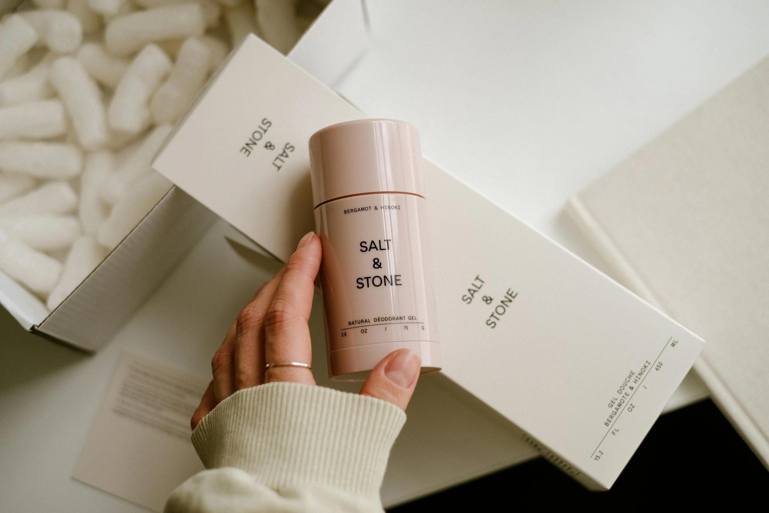
woman's hand with pink nails a thin gold ring and wearing a cream sweater holding a pale pink cylinder container of bergamot scented deoderant sitting on top of a tall white box

Logo Design: Crafting Lasting Visual Identities

December 20, 2024

Creating an effective logo is so much more than just slapping together some design elements and fonts. It’s an art form that goes way beyond the surface of “it just looks cool.” There’s a focus on building a visual identity that truly captures a brand’s spirit and tells its story in just one look. When I sit down to design a logo, I like to keep these key principles in mind: simplicity, versatility, timelessness, and relevance.

Simplicity is a big one for me. I want the logo to be instantly recognizable, something that sticks in your mind even if you only see it for a second. A clean, straightforward design is easier to remember, and let’s be honest, who doesn’t love a logo that’s easy on the eyes?

Next up is versatility. A good logo needs to look great in every environment. You must take into account that it could be printed on a tiny business card, blown up on a billboard, or displayed on a website. I make sure that the logos I create can adapt to all situations, so they always look their best.

Timelessness is also key. Trends come and go, but a great logo should have the power to be here for the long term. I aim to create designs that will stand the test of time, so clients won’t have to worry about their logo looking dated in a few years.

Finally, there’s relevance. The logo needs to resonate with the brand’s target audience. It should feel connected to the brand’s identity and purpose, creating a strong and meaningful impression.

These principles aren’t just guidelines, they’re the foundation of every logo I design. They help me create logos that aren’t just pretty pictures but powerful symbols that represent the heart of a brand. Take a look at some of the logo projects I’ve worked on over the years, here. You’ll see how my work represents an adherence to these principles.

gold boxy metal robot figurine standing on top of white piano keys pointing its arm to the right

Trends in Graphic Design: Illustrations & Logo Mascots

December 17, 2024

There is a substantial rise in the use of illustration in general, along with the use of logo mascots. This trend is particularly booming in the food and beverage industry but is also making waves in other markets like tech and startups. I find logo mascots to be a supremely fun way to apply a humanistic approach to a brand, making it feel more relatable. This, in turn, can truly help in creating brand recognition and loyalty. These sometimes charming creations can add a playful touch to a business’s brand identity, which helps in also building a strong connection. Whether it's a cute animal, a quirky fantastical character, or a whimsical figure, these mascots bring a unique personality to the brand.

As more businesses recognize the benefits of this trend, we can expect to see a lot more engaging logo designs. Logo mascots not only make a brand memorable but also create an emotional bond with customers. They can be used across various marketing materials, from packaging design to social media design to website design. By incorporating illustrations and logo mascots, companies are finding new ways to communicate their values and narratives in a more entertaining manner. This trend looks like it’s been redefining how brands connect with their audiences.

six women standing against a white brick wall all with dark brown hair wearing multi-colored clothing in colors of coral, green, yellow, brown, red, gold and black, yellow, and red geometric patterning

The Business of Color: Color Trends

December 11, 2024

Color trends in graphic design are all about making bold statements. From vibrant, clashing tones that grab your attention to earthy, muted palettes that bring a sense of calm, color is really setting the mood in today’s design world. I’m seeing a lot of designers playing with unexpected combinations like bright yellows with deep purples or soft pastels paired with rich, dark hues. These trends are not only fresh but also versatile, whether you’re working on a logo, website, or social media graphics. If you’re looking to make your brand stand out, experimenting with these current color trends can give your design that modern edge.

color trends of 2024:

  • Browns

  • Cobalt blue

  • Golds

  • Neutrals: taupes, terracottas, beiges

  • Bright bubblegum

  • Black and white

  • Regal hues: purples, golds, creams

  • Pearlescence

  • Orange

  • Cherry red

  • Color of the year: peach fuzz (Pantone 13-1023)

black spiral notebook with bright white page showing that has a simple sketch made with black pen of flowers, stems, leaves, and small buds and the notebook is set on a brown wood table

Logo Design: Mistakes to Avoid

December 3, 2024

Even seasoned designers can fall into traps when designing logos. One common mistake is overcomplicating the design. A logo should be clear and concise, not cluttered with unnecessary details. Another attractive trap is relying too heavily on trends. While it is important to stay current, a logo needs to have longevity, not just follow the newest, latest, and greatest shiny thing. Failing to consider scalability is another issue. A logo that looks great on a website might not translate well to smaller sizes, like a social media profile picture. I like to remind myself to keep these potential mistakes in mind to ensure the final logo is both effective and timeless.

watercolor paintings inside of rows of rectangles showing gradients of blue to orange, blue to green, blue to yellow, blue to purple

The Business of Color: Color Palette

November 27, 2024

Let’s jump in and splash around some color. Whether you’re designing a logo, a website, or social media graphics, your choice of colors can make or break your design. For beginners, let’s get into it: a color palette is simply a selection of colors that you use consistently across a project or brand. It’s important because it sets the tone and emotion and helps communicate your intended message. Imagine creating a logo for a construction company; you’d probably consider using bold colors like deep blues, blacks, oranges, grays, browns, and blues to promote boldness, stability, and presence. On the flip side, a life coaching startup might benefit from soothing greens, soft yellows, and calming cream colors. Understanding the basics of color theory and how colors work together is the first step in crafting an effective palette.

Here are some tips and tricks for creating a cohesive and appealing color palette for your projects: First, consistency is key. Using the same colors across your designs helps strengthen your brand identity, making your work more and more recognizable. There are plenty of tools out there that can help with creating and testing various color palettes, such as Adobe Color. I really love this one for it’s versatility and the multitude of palettes it spits out for me. It allows me a really efficient way to experiment with different combinations and see how they look together. It’s also a great idea to research effective color palettes from brands you admire and feel inspired by for inspiration on your project. Don’t be afraid to rebrand your color palette as needed to stay relevant and fresh. Lastly, always test your palette in different contexts to ensure it works well across the board, from print to digital. These tips can help you get well on your way to creating color palettes that not only look great but also enhance your presence.

an orange and yellow gradient blurry circular shape against a blue-ish grey background

Trends in Graphic Design: Color Gradients

November 20, 2024

Gradients are nothing new in graphic design. In fact, I’ve not only seen regular use of them since my college days, but there was often a sense of opposition when it came to using gradients. As things go in life, certain aesthetics are sometimes shunned only to come back with a bang in the not too distant future. In 2024, we’ve seen a revolution and evolution in how they're used. Gradients are all about making bold statements with smooth color transitions that catch the eye without overwhelming the viewer. There can be such a softness and an all-encapsulating soothing feeling introduced by them. I love how gradients can saturate designs with all forms of energy and depth, creating a modern and dynamic feel. The transition between two or more colors can add a distinct edge to your work, making it stand out in a unique way. This trend is a fantastic way to incorporate bright, striking colors in a modern way.

young man with black glasses, grey shirt, and blue jean jacket speaking to a blond woman in a black sweater at a green table at an outside patio with a silver laptop sitting on top and blurry muted green trees in the background

Logo Design: Collaboration and Feedback

November 13, 2024

Logo design is not a solo endeavor. It is a collaborative process that involves constant communication and feedback from the client. I always start by discussing ideas with the client and getting a sense of their vision. As the design progresses, I present different concepts and encourage honest feedback. This back-and-forth ensures that the final logo is something the client is truly happy with and that it aligns perfectly with their brand. I have found that the best designs come from this kind of open collaboration, where ideas are shared, refined, and perfected together.

a birds-eye photo of wavy diagonal lines of light tan sand dunes

Trends in Graphic Design: Texture

November 12, 2024

The use of texture in graphic design has only been increasing, offering a great way to capture audiences on a more sensory level. Texture adds depth and richness to designs, creating a tactile experience that itches our innate desires as humans to touch, taste, and feel. This year, we’re seeing texture being applied in more and more ways, including within typography, which adds a surrealist touch to the artwork. By implementing texture, designers can transform flat graphics into multi-dimensional experiences that help enhance the viewer’s connection to the content.

This trend is making a notable impact across various design fields, from logo design and branding design to web design and printed marketing collateral.

white desk with a white book with orange cover saying Brand Identity on it and a white keyboard and silver macbook computer on top

Brand Identity

November 6, 2024

I love what I do and the magic behind creating a brand identity. There's something really fulfilling about breathing new life into a company, crafting its voice, and giving it a visual identity that makes an impact.

Brand identity is more than just a logo, color scheme, or an icon. It's the face and voice of a company that creates it’s actual existence in this world. It’s the combination of all elements that a business uses to portray the right image to its audience. From typography to imagery, every choice we make as designers helps to shape how a brand is perceived, received, and noticed. When I start working on a brand identity, I dive into researching their market, competitors, and the overall realm of the field. I want to understand the history, the goals, and the audience. This initial phase is where the jolt of creativity begins. It's where I get to know the brand inside and out, ensuring that my design decisions align with its mission and vision.

It all starts with understanding the brand’s mission and vision. I ask questions like, "What story does this brand want to tell?" and "How should people feel when they experience the brand?" These questions help guide the creative process, ensuring that the final design resonates with the company’s audience. Once the foundation is established and understood, I dive into the design realm of brainstorming and sketching. This phase is all about exploration and experimentation. I play with different concepts, color palettes, and typography. I like to take my ideas to paper, usually sketching out my rough ideas with my pencil and eraser (my Command+Z tool). It's a really great phase where ideas gain a bit more life, and the true vision begins to form.

Every element of a brand identity is chosen with purpose. The logo, for instance, is the face of the brand. It needs to be memorable, versatile, and timeless. I often start with sketches, refining the concept until it captures what was in my head. Then, I take it to the computer, experimenting with colors, shapes, and fonts. Colors play a crucial role in brand identity. They evoke emotions and set the tone for the brand. Typography is another essential element. The right font can communicate a brand’s personality, whether it's bold and modern or classic and elegant. I love experimenting with different typefaces, finding the best possible match for the brand’s voice.

Consistency is key in brand identity. It’s about ensuring that all visual elements work harmoniously together across all platforms. From business cards to social media graphics, every piece needs to remain consistent to the brand’s voice. This consistency builds trust and recognition, making the brand easily identifiable to its audience. I love spending time creating brand guidelines that outline how to use the logo, colors, typography, graphic elements, and imagery. These guidelines serve as a blueprint, ensuring that the brand identity remains cohesive no matter where it’s applied. It’s incredibly satisfying to see a brand come to life with a strong, memorable presence.

A really rewarding aspect of my work is seeing the impact of a well-crafted brand identity. It’s not just about making something look good; it’s about creating a meaningful connection between the brand and its audience—to the human experience. A strong brand identity can elevate a business, making it stand out amongst the competition.

The world of brand identity is ever-evolving. Trends come and go, and technology continually offers new tools and technical possibilities. As a designer, I’m always learning and adapting, doing my best to keep up with the latest trends while being of the mindset that timeless design is extremely important. Every project is unique, presenting new challenges and opportunities to create something super special. Whether it’s a new startup or an established company looking to rebrand, I welcome them all. Especially if the company is food-related. That’s really fun work.

Brand identity is a real passion of mine. It's about creating visual stories that speak, evoke emotional reactions, and help companies find their voice. The excursion from concept to completion is filled with creativity, growth, experimentation, and satisfaction. At the true core of it all, it's about connecting people to brands in a meaningful way. That’s where the magic is in brand identity, and to be a part of striving to make people feel something is such a great experience for me.

sun setting in the distance with blue, orange, purple, and pink sky filled with fluffy clouds with a Whataburger fast food joint with a brightly lit orange W logo in front of a road with a silver SUV driving by surrounded by black trees

Logo Design: Creating Impact

November 2, 2024

Understanding Your Brand

Before any design work begins, it’s vital to immerse yourself in the essence of your brand. Ask yourself: What is the core message of your business? Who are your ideal customers? What emotions or ideas do you want your brand to evoke? What do they do and where do they hang out? These answers form the bedrock of your logo design process. Your logo should not just represent your business but also communicate its values and personality. For example, a brand focused on beauty and health might opt for sleek, elegant, minimalist designs with modern typography, whereas a company rooted in tradition and reliability might choose classic fonts and timeless symbols.

Simplicity with Impact

In logo design, simplicity is your ally. A simple logo can be easily recognized and remembered, making it more effective in various applications. Consider some of the world’s most iconic logos—Apple’s bitten apple, Nike’s swoosh—each is incredibly simple yet instantly recognizable. A well-designed, simple logo conveys professionalism and confidence. It avoids unnecessary details that can clutter the design and dilute its message. Instead, it focuses on clean lines, balanced proportions, and a harmonious color palette that resonates with the brand's identity.

The Power of Color

Color is an aesthetic choice and a psychological tool that can influence how your brand is perceived. Different colors evoke different emotions and associations, and the colors you choose for your logo will directly impact your brand's identity. For instance, blue often conveys trust, dependability, and professionalism, which is why it’s popular in industries like finance and healthcare. On the other hand, red is associated with energy, passion, and excitement, making it a good choice for brands that want to stand out and evoke strong emotions. Purple is often associated with luxury, creativity, and spirituality, evoking a sense of mystery and sophistication, which is why high-end beauty and fashion brands lean into this color. It’s also essential to consider how your logo’s colors will appear in various contexts, from digital screens to printed materials, and ensure it remains effective even in black and white.

Typography: The Voice of Your Logo

Typography in logo design is more than just selecting a font; it’s about choosing a style that speaks for your brand. The typeface you choose can communicate a range of attributes like modernity, tradition, playfulness, and seriousness, depending on your brand’s personality. A sans serif font like Tomato Grotesk might suggest a modern, inviting approach, while a serif font like Self Modern could evoke a sense of reliability, elegance, and tradition. The choice between all caps, lowercase, or a mix of both also affects how your logo is perceived. Every letter, every curve, and every space between characters contributes to the overall impression your logo makes.

Creating Timeless Appeal

While it’s tempting to follow design trends, a logo works amazingly as a timeless piece of art. Trends can give a logo an of-the-moment appeal, but they also risk making it look dated as styles change. A timeless logo, on the other hand, stays relevant year after year, continuing to represent your brand effectively without needing frequent updates. Think of the logos that have endured for decades—Coca-Cola, IBM, Ford—they’ve all retained their core design elements, allowing them to stand the test of time while maintaining a consistent brand image.

Versatility and Adaptability

A logo must be versatile enough to work across different platforms and mediums, from business cards and websites to billboards and packaging. This versatility requires a design that is simple enough to be recognizable at small sizes yet detailed enough to make an impact at larger scales. It should look just as good in monochrome as it does in full color and should be effective in both horizontal and vertical layouts. Ensuring your logo is adaptable helps maintain a consistent brand identity, no matter where it appears.

The Power of a Well-Designed Logo

A well-designed logo is a powerful tool in your branding arsenal. It’s the visual shorthand for your brand, conveying its essence in a single glance. By focusing on simplicity, using the psychological impact of color, selecting typography that aligns with your brand’s voice, and ensuring timelessness and versatility, you can create a logo that not only stands out but also stands the test of time. Investing in a thoughtfully crafted logo is an investment in your brand’s future, helping you build a memorable identity.

Your logo is the face of your brand and the symbol that people will come to associate with everything your business stands for. Make sure it’s a face that’s impossible to forget.

dark, medium, and pale pink geometric shapes make of stars, circles, triangles, and abstract forms creating a pattern together

Trends in Graphic Design: Geometry

October 30, 2024

Geometric design has made a strong comeback, reminiscent of mid-century aesthetics but with quite a bit of a twist. It’s really quite nice to see geometric shapes, patterns, and fonts becoming a focal point in graphic design. The clean lines and precise forms of geometry bring a sense of order and balance, creating art that is bold and eye-catching. This trend is about using simple shapes like circles, squares, rectangles, lines, and triangles in new ways to give birth to complex and appealing layouts. What I really enjoy about seeing geometric design is its versatility and also it’s timeless aesthetic. It can be adapted to fit various styles and business brands, from sleek and modern branding to playful and energetic. The principles of geometry help in creating a foundational and structural look, making it an excellent choice for designers aiming to convey clear and sophisticated communications. It really offsets the cluttered designs out there and stands out by simply using it’s simplicity and moving to the front of the visual “line.”

a glass window with a neon blue sign hanging that says OPEN in tan and black letters with the word SHOP underneath that is cut vinyl stuck on the glass and a blurry cafe seen through the window

Logo Design: Empowering Startup Business Clients

October 29, 2024

When I work with clients, particularly those facing mental health or physical challenges, I know that starting a business can feel overwhelming. The pressures of entrepreneurship, combined with managing personal well-being, can be a lot to handle. That's why my approach is centered on empathy, patience, and genuine collaboration. I’m not just here to design a logo; I’m here to support you through this process, ensuring that it’s as stress-free and rewarding as possible.

Our journey begins with understanding your vision, but more importantly, understanding you. I take the time to listen, to really grasp what drives you and what your brand stands for. Whether you’re navigating anxiety, physical limitations, or any other challenges, I’m here to make sure that these factors are acknowledged and respected in our work together. This isn’t about rushing to a final product; it’s about creating something meaningful that aligns with who you are and what you want your business to represent.

As we work through the design process, I encourage open and honest communication. Your feedback isn’t just welcomed; it’s essential. Together, we refine and adjust the design until it feels right—until it feels like you. The logo we create is more than just a visual representation; it’s a symbol of your journey, your resilience, and your new business venture.

In the end, my goal is to empower you with a brand identity that you can proudly stand behind. It’s about crafting something that not only looks great but also resonates deeply with your personal and business story. I’m honored to be part of this journey with you, helping you turn your vision into reality, one thoughtful design at a time.

← Newer Posts Older Posts →

Latest Posts

Featured
Jul 23, 2025
Custom Illustrations: Storytelling
Jul 23, 2025
Jul 23, 2025
Jul 9, 2025
Custom Illustrations: Creating a Personal Touch
Jul 9, 2025
Jul 9, 2025
Jul 3, 2025
Custom Illustrations: Elevating Brands
Jul 3, 2025
Jul 3, 2025
Jun 24, 2025
Custom Illustrations: Benefits in Branding
Jun 24, 2025
Jun 24, 2025
Jun 18, 2025
SEO: Projects with SEO Growth
Jun 18, 2025
Jun 18, 2025

design by c

dsgn.by.c@gmail.com
303.997.2884