• Work
  • About
  • Blog
  • Contact
Menu

CJ

  • Work
  • About
  • Blog
  • Contact
a birds-eye photo of wavy diagonal lines of light tan sand dunes

Trends in Graphic Design: Texture

November 12, 2024

The use of texture in graphic design has only been increasing, offering a great way to capture audiences on a more sensory level. Texture adds depth and richness to designs, creating a tactile experience that itches our innate desires as humans to touch, taste, and feel. This year, we’re seeing texture being applied in more and more ways, including within typography, which adds a surrealist touch to the artwork. By implementing texture, designers can transform flat graphics into multi-dimensional experiences that help enhance the viewer’s connection to the content.

This trend is making a notable impact across various design fields, from logo design and branding design to web design and printed marketing collateral.

white desk with a white book with orange cover saying Brand Identity on it and a white keyboard and silver macbook computer on top

Brand Identity

November 6, 2024

I love what I do and the magic behind creating a brand identity. There's something really fulfilling about breathing new life into a company, crafting its voice, and giving it a visual identity that makes an impact.

Brand identity is more than just a logo, color scheme, or an icon. It's the face and voice of a company that creates it’s actual existence in this world. It’s the combination of all elements that a business uses to portray the right image to its audience. From typography to imagery, every choice we make as designers helps to shape how a brand is perceived, received, and noticed. When I start working on a brand identity, I dive into researching their market, competitors, and the overall realm of the field. I want to understand the history, the goals, and the audience. This initial phase is where the jolt of creativity begins. It's where I get to know the brand inside and out, ensuring that my design decisions align with its mission and vision.

It all starts with understanding the brand’s mission and vision. I ask questions like, "What story does this brand want to tell?" and "How should people feel when they experience the brand?" These questions help guide the creative process, ensuring that the final design resonates with the company’s audience. Once the foundation is established and understood, I dive into the design realm of brainstorming and sketching. This phase is all about exploration and experimentation. I play with different concepts, color palettes, and typography. I like to take my ideas to paper, usually sketching out my rough ideas with my pencil and eraser (my Command+Z tool). It's a really great phase where ideas gain a bit more life, and the true vision begins to form.

Every element of a brand identity is chosen with purpose. The logo, for instance, is the face of the brand. It needs to be memorable, versatile, and timeless. I often start with sketches, refining the concept until it captures what was in my head. Then, I take it to the computer, experimenting with colors, shapes, and fonts. Colors play a crucial role in brand identity. They evoke emotions and set the tone for the brand. Typography is another essential element. The right font can communicate a brand’s personality, whether it's bold and modern or classic and elegant. I love experimenting with different typefaces, finding the best possible match for the brand’s voice.

Consistency is key in brand identity. It’s about ensuring that all visual elements work harmoniously together across all platforms. From business cards to social media graphics, every piece needs to remain consistent to the brand’s voice. This consistency builds trust and recognition, making the brand easily identifiable to its audience. I love spending time creating brand guidelines that outline how to use the logo, colors, typography, graphic elements, and imagery. These guidelines serve as a blueprint, ensuring that the brand identity remains cohesive no matter where it’s applied. It’s incredibly satisfying to see a brand come to life with a strong, memorable presence.

A really rewarding aspect of my work is seeing the impact of a well-crafted brand identity. It’s not just about making something look good; it’s about creating a meaningful connection between the brand and its audience—to the human experience. A strong brand identity can elevate a business, making it stand out amongst the competition.

The world of brand identity is ever-evolving. Trends come and go, and technology continually offers new tools and technical possibilities. As a designer, I’m always learning and adapting, doing my best to keep up with the latest trends while being of the mindset that timeless design is extremely important. Every project is unique, presenting new challenges and opportunities to create something super special. Whether it’s a new startup or an established company looking to rebrand, I welcome them all. Especially if the company is food-related. That’s really fun work.

Brand identity is a real passion of mine. It's about creating visual stories that speak, evoke emotional reactions, and help companies find their voice. The excursion from concept to completion is filled with creativity, growth, experimentation, and satisfaction. At the true core of it all, it's about connecting people to brands in a meaningful way. That’s where the magic is in brand identity, and to be a part of striving to make people feel something is such a great experience for me.

sun setting in the distance with blue, orange, purple, and pink sky filled with fluffy clouds with a Whataburger fast food joint with a brightly lit orange W logo in front of a road with a silver SUV driving by surrounded by black trees

Logo Design: Creating Impact

November 2, 2024

Understanding Your Brand

Before any design work begins, it’s vital to immerse yourself in the essence of your brand. Ask yourself: What is the core message of your business? Who are your ideal customers? What emotions or ideas do you want your brand to evoke? What do they do and where do they hang out? These answers form the bedrock of your logo design process. Your logo should not just represent your business but also communicate its values and personality. For example, a brand focused on beauty and health might opt for sleek, elegant, minimalist designs with modern typography, whereas a company rooted in tradition and reliability might choose classic fonts and timeless symbols.

Simplicity with Impact

In logo design, simplicity is your ally. A simple logo can be easily recognized and remembered, making it more effective in various applications. Consider some of the world’s most iconic logos—Apple’s bitten apple, Nike’s swoosh—each is incredibly simple yet instantly recognizable. A well-designed, simple logo conveys professionalism and confidence. It avoids unnecessary details that can clutter the design and dilute its message. Instead, it focuses on clean lines, balanced proportions, and a harmonious color palette that resonates with the brand's identity.

The Power of Color

Color is an aesthetic choice and a psychological tool that can influence how your brand is perceived. Different colors evoke different emotions and associations, and the colors you choose for your logo will directly impact your brand's identity. For instance, blue often conveys trust, dependability, and professionalism, which is why it’s popular in industries like finance and healthcare. On the other hand, red is associated with energy, passion, and excitement, making it a good choice for brands that want to stand out and evoke strong emotions. Purple is often associated with luxury, creativity, and spirituality, evoking a sense of mystery and sophistication, which is why high-end beauty and fashion brands lean into this color. It’s also essential to consider how your logo’s colors will appear in various contexts, from digital screens to printed materials, and ensure it remains effective even in black and white.

Typography: The Voice of Your Logo

Typography in logo design is more than just selecting a font; it’s about choosing a style that speaks for your brand. The typeface you choose can communicate a range of attributes like modernity, tradition, playfulness, and seriousness, depending on your brand’s personality. A sans serif font like Tomato Grotesk might suggest a modern, inviting approach, while a serif font like Self Modern could evoke a sense of reliability, elegance, and tradition. The choice between all caps, lowercase, or a mix of both also affects how your logo is perceived. Every letter, every curve, and every space between characters contributes to the overall impression your logo makes.

Creating Timeless Appeal

While it’s tempting to follow design trends, a logo works amazingly as a timeless piece of art. Trends can give a logo an of-the-moment appeal, but they also risk making it look dated as styles change. A timeless logo, on the other hand, stays relevant year after year, continuing to represent your brand effectively without needing frequent updates. Think of the logos that have endured for decades—Coca-Cola, IBM, Ford—they’ve all retained their core design elements, allowing them to stand the test of time while maintaining a consistent brand image.

Versatility and Adaptability

A logo must be versatile enough to work across different platforms and mediums, from business cards and websites to billboards and packaging. This versatility requires a design that is simple enough to be recognizable at small sizes yet detailed enough to make an impact at larger scales. It should look just as good in monochrome as it does in full color and should be effective in both horizontal and vertical layouts. Ensuring your logo is adaptable helps maintain a consistent brand identity, no matter where it appears.

The Power of a Well-Designed Logo

A well-designed logo is a powerful tool in your branding arsenal. It’s the visual shorthand for your brand, conveying its essence in a single glance. By focusing on simplicity, using the psychological impact of color, selecting typography that aligns with your brand’s voice, and ensuring timelessness and versatility, you can create a logo that not only stands out but also stands the test of time. Investing in a thoughtfully crafted logo is an investment in your brand’s future, helping you build a memorable identity.

Your logo is the face of your brand and the symbol that people will come to associate with everything your business stands for. Make sure it’s a face that’s impossible to forget.

dark, medium, and pale pink geometric shapes make of stars, circles, triangles, and abstract forms creating a pattern together

Trends in Graphic Design: Geometry

October 30, 2024

Geometric design has made a strong comeback, reminiscent of mid-century aesthetics but with quite a bit of a twist. It’s really quite nice to see geometric shapes, patterns, and fonts becoming a focal point in graphic design. The clean lines and precise forms of geometry bring a sense of order and balance, creating art that is bold and eye-catching. This trend is about using simple shapes like circles, squares, rectangles, lines, and triangles in new ways to give birth to complex and appealing layouts. What I really enjoy about seeing geometric design is its versatility and also it’s timeless aesthetic. It can be adapted to fit various styles and business brands, from sleek and modern branding to playful and energetic. The principles of geometry help in creating a foundational and structural look, making it an excellent choice for designers aiming to convey clear and sophisticated communications. It really offsets the cluttered designs out there and stands out by simply using it’s simplicity and moving to the front of the visual “line.”

a glass window with a neon blue sign hanging that says OPEN in tan and black letters with the word SHOP underneath that is cut vinyl stuck on the glass and a blurry cafe seen through the window

Logo Design: Empowering Startup Business Clients

October 29, 2024

When I work with clients, particularly those facing mental health or physical challenges, I know that starting a business can feel overwhelming. The pressures of entrepreneurship, combined with managing personal well-being, can be a lot to handle. That's why my approach is centered on empathy, patience, and genuine collaboration. I’m not just here to design a logo; I’m here to support you through this process, ensuring that it’s as stress-free and rewarding as possible.

Our journey begins with understanding your vision, but more importantly, understanding you. I take the time to listen, to really grasp what drives you and what your brand stands for. Whether you’re navigating anxiety, physical limitations, or any other challenges, I’m here to make sure that these factors are acknowledged and respected in our work together. This isn’t about rushing to a final product; it’s about creating something meaningful that aligns with who you are and what you want your business to represent.

As we work through the design process, I encourage open and honest communication. Your feedback isn’t just welcomed; it’s essential. Together, we refine and adjust the design until it feels right—until it feels like you. The logo we create is more than just a visual representation; it’s a symbol of your journey, your resilience, and your new business venture.

In the end, my goal is to empower you with a brand identity that you can proudly stand behind. It’s about crafting something that not only looks great but also resonates deeply with your personal and business story. I’m honored to be part of this journey with you, helping you turn your vision into reality, one thoughtful design at a time.

deep brown stopwatch with a black face housing shiny gold roman numerals, silver clock hands, and vibrant gold gears with a blurry chain in the background

Logo Design: Color Trends and Timelessness

October 23, 2024

One of the biggest challenges in logo design is finding the balance between staying current and creating something timeless. I am always aware of the latest design trends, but I never let them dictate the entire design. A logo needs to look just as good ten years from now as it does today. That is why I focus on creating designs that have a timeless quality while incorporating modern elements that keep the brand relevant. By combining classic design principles with contemporary touches, I ensure that the logos I create will remain effective and appealing for years to come.

black printer sitting on a wooden floor with printed pictures set on top and a paper feeding through the printer that says WEEK 1 in large letters and surrounded by deep green potted plants and a yellow, blue, and brick red carpet in the background

Print vs Digital: Design Differences

October 16, 2024

Print design and digital design might seem similar at first, but as graphic designers we have learned and now know they involve very distinct techniques, considerations, and executions. Both mediums offer unique opportunities and becoming fluent with each one requires a thorough understanding of their differences.

Print design

A focus in creating tangible materials. Everything from business cards to brochures to posters falls into this category. With print design, color accuracy is supremely important. I always work in CMYK color mode because it closely matches how colors will appear when printed. It’s important to consider how different papers and finishes will affect the final look and feel of your design. For example, glossy finishes can make colors punch, while matte finishes can give a more subdued, soft appearance. Typography also needs to be carefully managed in print; text should be clear and legible, with appropriate size and spacing. One of the best practices I follow is to always test print from home to see how the design translates from screen to paper. This step can reveal issues like color shifts or unexpected text size changes that aren’t obvious on a digital display. This gives me the opportunity to check font size, layout, and the dreaded double-spaces. It is really good to use a color calibrator for your screens, ever so often, to ensure optimal color matching.

digital design

A focus on creating visuals that are best for screens. This includes websites, social media graphics, and digital ads. Here, RGB color mode is used because it’s optimized for screens, providing more vibrant colors compared to CMYK. Digital designs need to be responsive, meaning they should look good on various devices and screen sizes. This requires designing with adaptability in mind, so elements can adjust seamlessly whether viewed on a phone or computer. Another advantage of digital design is the ability to include interactive elements like animations, which can enhance the user experience. It’s important to test your designs on multiple devices and browsers to ensure they appear as intended everywhere.

Gaining success in both areas comes down to understanding the specific requirements of each medium and also how they can work together. Whether you’re working with the hands-on nature of print or the animated possibilities of digital, keeping these tips in mind will help you create some really great designs.

acid green hood of a car with a closeup shot of the silver and blue Ford motors logo that is a long horizontal oval with a bright silver border, navy blue interior and silver cursive writing spelling out Ford

Logo Design: Successful Logos

October 9, 2024

When I look at iconic logos like the Nike swoosh or the Coca-Cola logo, I see more than just clever design. I see symbols that have become deeply ingrained in our culture. What makes these logos so successful? It is their simplicity, consistency, and strong connection to the brand they represent. The Nike swoosh, for example, is sleek and dynamic, perfectly reflecting the brand’s athletic focus. The Coca-Cola logo is clean, nostalgic, and modern, just like the company’s products. These logos are also incredibly versatile, working well in any size or format. By studying these examples, I am reminded of the power a well-designed logo can have in shaping a brand’s identity.

bright yellow, blue, pink, white, and black rectangular patterned graphics with words in the center that say MAKE CREATE SLEEP REPEAT

Trends in Graphic Design: Bold Typography

October 2, 2024

An exciting graphic design trend this year is the use of bold type and typography. As a designer, I find it pretty refreshing to see how bold type is being used to make rapid statements and capture attention. Whether it's for branding, advertising, or digital media, bold typography adds a sense of confidence and clarity to any design. It lends itself to making sure that messaging stands out and resonates with an audience. The use of thick, eye-catching letters draws viewers in and conveys a modern and dynamic feel. I really enjoy when it’s used in the headers of webpages, and especially if the type is animated in some fashion.

Grabbing and grasping onto people’s attention is more challenging than ever with the constant decrease in attention spans. This is where bold typography truly shines. It cuts through that barrier and helps communicate in a quick, efficient, and effective way. Bold fonts are loud, yes. But, they are also about being concise and memorable. They help in creating a strong visual hierarchy, guiding the viewer’s eye to the most important parts of the content. The strategic and intentional use of bold typography is becoming paramount for impactful design in the realm of creativity.

dusty pink car paint with a close up shot of the silver cursive thunderbird logo and a reflection of people, white tents, palm trees, and blue sky shown on the car

Logo Design: More on Typography

September 30, 2024

Typography is a complete game-changer in logo design. The right font choice and how that font is treated goes far beyond looks. It’s more than what’s seen at face value because it tells the brand’s story and communicates its personality. When I design a logo, I focus on the typography because it can elevate a brand or send mixed signals.

For a tech startup that’s pushing boundaries, a clean and modern sans serif font often fits the bill. It’s minimalist and sharp, reflecting innovation and forward-thinking. When I work with a company that wants to convey trust, elegance, and heritage, I usually opt for a serif font. The subtle strokes and curves exude reliability and a sense of timelessness.

But the choice of font is just the beginning. The size, spacing, and weight of the text can make a logo feel either balanced or chaotic. I dedicate a lot of time to refining these details, experimenting with different variations to find that perfect combination where the typography enhances the logo. Every small adjustment can shift the overall tone of the design.

No matter how creative the font is, if it’s hard to read, the message gets lost. Keep in mind the logo’s scalability, ensuring it looks sharp and clear whether it’s on a billboard or a business card. Another tip is to limit the number of fonts you use. Sticking to one or two fonts keeps the design cohesive and avoids overwhelming the viewer. Pay attention to kerning, the space between letters, to ensure balanced and harmonious text. Finally, don’t be afraid to experiment with custom lettering or subtle tweaks to existing fonts.

image of a pool with bright blue water and silver hand rails attached to a vibrant yellow floor

Trends in Graphic Design: Color Clashing

September 25, 2024

Color clashing is taking it to a whole new level with bold, electric, and innovative color palettes. This trend is being embraced not only for its powerful visual impact but also to meet the needs of audiences to be stopped in their tracks and take notice. This means we're seeing more daring color combinations that catch the eye and make designs explode. I love how contrasting hues bring energy and excitement to branding design. Coupled with the rising trend of logo mascots, brands are using these elements to create such a new way of capturing your attention.

bright orange wall with a bright orange megaphone attached to it casting a harsh black shadow onto the wall

Logo Design: Color Psychology

September 19, 2024

Colors evoke emotions, and in logo design they are a powerful tool. I always carefully consider the colors I use in a logo, understanding the psychological impact they will have on the audience. For example, blue often conveys trust and professionalism, which is why it is popular in the tech and finance industries. Red, on the other hand, is bold and energetic, making it a great choice for brands that want to stand out. I never choose colors at random; every shade has a purpose. By leveraging color psychology, I can create logos that resonate with the audience on a deeper level and reinforce the brand’s message.

a vintage photo of women in the 70's serving themselves food at a picnic table with watermelon, salad, pot of chili, and white and red dixi cups on top of a red and white checkered tablecloth

Trends in Graphic Design: '70s Nostalgia

September 17, 2024

I’ve been seeing a super splendid rebirth of ‘70s nostalgia in graphic design, bringing a touch of the good old days to the present. As someone who loves exploring design trends, I'm excited to see the return of faded color palettes, retro stripes, checkers, florals, and fun food-related advertisements and packaging that defined that period. This trend offers a refreshing break from the high-tech, AI-driven aesthetics that overtook 2023. We get an opportunity to reconnect with a simpler, cozy past that brings a nice warmth and charm. ‘70s-inspired designs create a sense of familiarity and comfort, resonating with people who have directly experienced that era and also the newbies.

Incorporating ‘70s elements into designs adds a unique flair and instills a sense of nostalgia that can cause a moment of pause and refreshment. I find that the use of retro patterns and colors brings an inviting, playful energy to projects where it makes sense to introduce this theme. More than just a visual throwback; it's a celebration of a time when design was bold, expressive, and full of character. By blending the old with the new, designers are able to create designs that are both timeless and current, capturing the best of both worlds and implementing them into your logo designs, website designs, and social media feeds.

black and white photo of three long-tailed birds sitting closely together on an electric wire against a white sky

Trends in Graphic Design: Minimalism

September 10, 2024

I've been captivated by the elegance and impact of minimalism for some time. In 2024, the trend of designing with minimalism has only grown stronger, which makes sense since it matches the ever-decreasing attention span of humans in this “rocket ship-speed” world. Simplicity and clarity in design allow for a more immediate experience, whether it's for logos, websites, social media, or printed marketing materials.

Minimalist design is all about peeling away elements to get to the bare and direct outcome. This approach ensures that your brand's message is conveyed with efficiency and impact. For logo design, minimalism means creating clean, versatile marks that stand the test of time. A simple yet effective logo can speak volumes about your brand's identity without overwhelming the viewer.

When it comes to website design, minimalism enhances the user experience by providing a seamless, intuitive, and clear interaction. By utilizing white and negative space, bold typography, and a minimalistic color palette, we can create visually appealing and user-friendly interfaces that effortlessly direct users through the content. Getting to the point as quickly as possible is the goal here.

Social media graphics benefit immensely from minimalism as well. In a sea of erratic feeds, a well-crafted, minimalist post stands out, grabbing attention and conveying your message quickly. By making all space within your canvas count, you ensure your graphics are eye-catching and stick to the brand. Bold-colored backgrounds, simple type and typography, and/or using images as a background texture are almost a beacon to the eyes of viewers with all of the scattered-like visuals.

Printed marketing materials like business cards, brochures, and flyers also stand out with implementing this design trend. By focusing on essential elements, clear messaging, and clean typography, we can create tangible and lasting pieces.

If you're in need of logos, website design, social media graphics, or printed marketing materials, consider embracing the minimalist trend. It’s a powerful way to elevate your brand and connect with your audience. Let's work together to bring clarity and elegance to your brand's visual identity in 2024.

black and bright yellow raincoat with a grey logo on the right shoulder stating THE NORTH FACE with a half rainbow looking graphic pouring out of the right side of the letters and a blurry rocky background with snowy mountains in the distance

Logo Design: Concept to Completion

September 3, 2024

Designing a logo is a journey. It starts with understanding the client’s vision, figuring out what they want (or giving them what they never knew they always needed), and the brand’s values. I like to begin by gathering as much information as possible through discussions and research. I also like to send each client a logo survey that asks some more in-depth questions, which helps them understand that this is also a collaboration and I’m taking into account their needs. I like to sprinkle in a few fun questions in the survey like, “If your logo had a superpower, what would it be.” Once I have a solid foundation, I move into brainstorming and sketching out ideas with pencil and paper. This is where creativity flows out of me, and I explore different styles and concepts. After refining the sketches, I bring the designs into digital form, tweaking and adjusting until everything feels just right. The final step is presenting the options to the client, getting their feedback, and making any necessary revisions. I like to limit the amount of revisions a client gets so that they are super intentional with the feedback they provide, and it streamlines the process of the project. It is a collaborative process, but the end goal is always the same: a logo that perfectly captures the brand.

a black background a white mask showing a scary smiling face mask peaking in from the shadows

Trends in Graphic Design: Anti-design

August 29, 2024

The graphic design world has been embracing the rebellious nature of anti-design, a trend that's all about breaking the rules and jumping way outside of the box. I love how this style mixes fonts of various weights, font families, and fonts sizes. Overlapping text and challenging spacing proximity is encouraged. Even using diagonal compositions to create a sense of organized and strategic chaos is A-ok. It's a really bold approach that challenges the foundations and guidance of traditional design, making it perfect for events like festivals, concerts, and creative industry gatherings. What excites me about anti-design is how it encourages us to think outside the box and experiment, experiment, experiment! By deliberately embracing imperfections and the unexpected, anti-design can create a powerful punch. This trend captures attention and inspires creativity and individuality, making it a significant movement in the design world this year. Let’s celebrate uniqueness and blasting through boundary walls. Trying new and different makes things fun and influences change and growth in a designer.

pen and marker sketch in blues, blacks, greys, and greens showing very simple shapes and placeholders that make up the page sections of a website showcasing where image and text will go

Website Design: For Beginners

August 27, 2024

When you're just starting with website design, it can feel like a massive, intimidating world full of code, color palettes, and content that all need to come together in a sensible way. I remember when I first dove into web design, and everything seemed like it had to be perfect from the start. But trust me, it’s all about taking those first steps and learning as you go.

The most important thing to keep in mind is that a website isn't just a digital business card or storefront; it's a vital part of your brand’s presence. It’s the first place your potential clients will land, and you want to make sure they stick around. Think about user experience (UX). You want your site to be easy to navigate, fast-loading, and visually captivating. Start with simple layouts and build your way up. Tools like WordPress or Squarespace can be lifesavers for beginners (and also for advanced designers), offering templates that are both easy to customize and professional-looking.

Don't shy away from experimenting with color schemes and fonts, but always keep readability and brand consistency in mind. And yes, SEO (Search Engine Optimization) is such an important factor to keep in mind, even at the design stage. Use SEO-friendly elements like clean URLs, alt text for images, and fast-loading pages to help your site rank better on Google.

If you’re stuck or feel overwhelmed, that’s okay! It’s all part of the process, and with each step, it will get more comfortable and more seamless. I’m here to guide you through every step, from setting up your site to tweaking the finer details. Let go of thinking that it has to be perfect. You just need to start. Let’s create something that not only looks great but also enhances your business and achieves your goals.

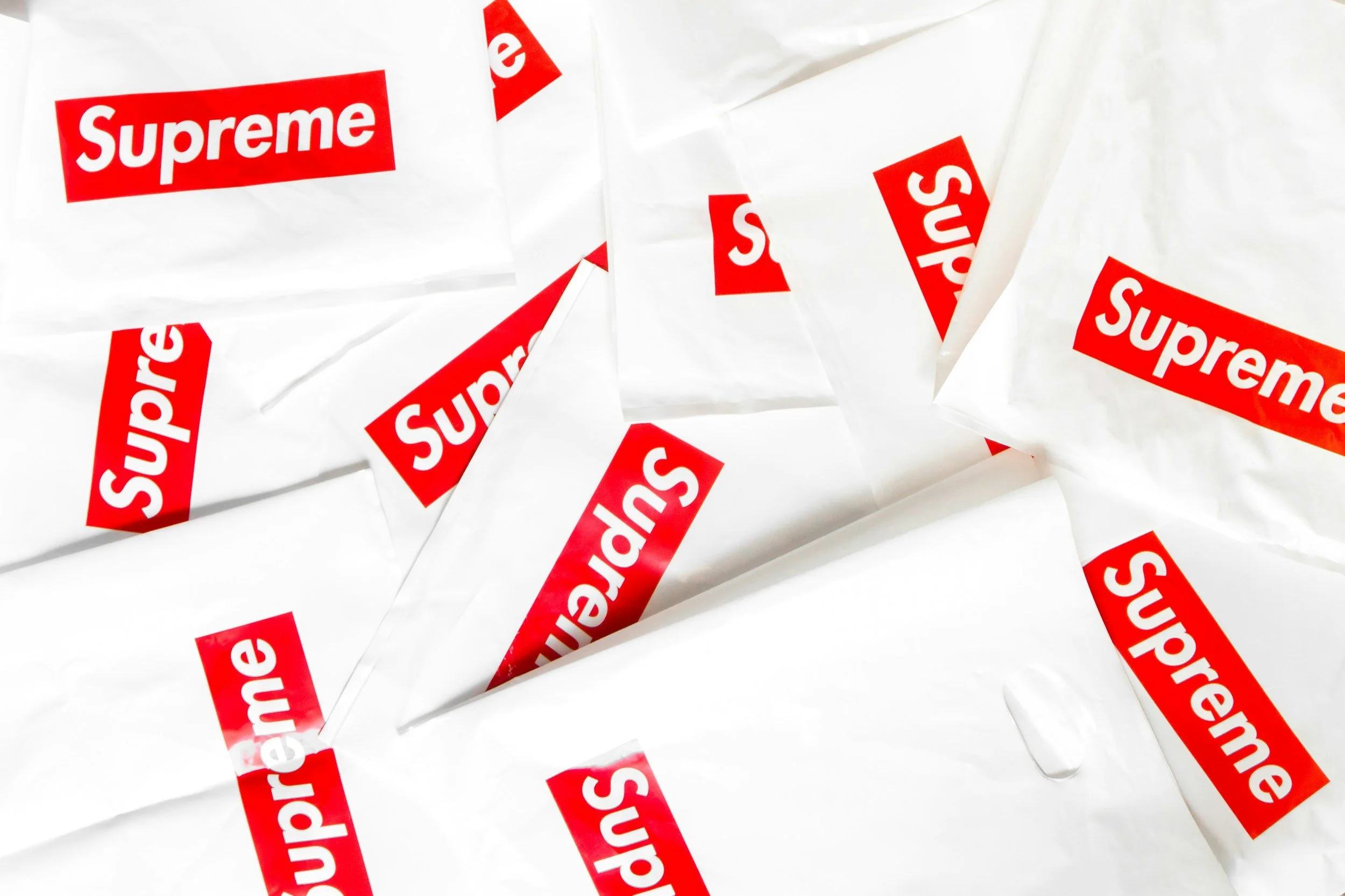
white plastic bags spread out in a collage format with bright red rectangles on each of them housing the word Supreme

Logo Design: Typography

August 22, 2024

Typography can make or break a logo. The choice of font speaks volumes about the brand's personality. When I am designing a logo, I pay close attention to the typography, ensuring that it aligns with the brand's identity. For a modern and sleek brand, a sans-serif font might be the perfect choice, while a serif font could lend a more traditional and trustworthy feel. The size, spacing, and weight of the text all play a role in how the logo is perceived. I always test different variations to see what works best and ensure that the typography complements the overall design rather than competing with it.

bright orange paper cranes made of very grainy texture paper floating above a white table

Trends in Graphic Design: 3D Type

August 20, 2024

As a graphic designer who has such an extreme love of fonts and typography, I can't help but enjoy seeing and being inspired by the 2024 trend of using 3D type and typography. There's something undeniably thrilling about seeing type come to life, leaping off the page or screen and engaging with viewers in a whole new dimension. Ever since college, I’ve grown to love how lively fonts can be and become. This trend is about adding depth and creating immersive experiences that just make type stand out, making people feel like they can reach out and touch the text. The tactile quality of 3D type transforms ordinary words into another level of art, making letters a much more elevated experience for the eyes.

What excites me most about this trend is its versatility and for its enhancement of creative expression. Whether it's bold, chunky letters that feel solid and substantial or sleek, futuristic type that looks like it’s been pulled from a sci-fi movie, or slimy and glossy effects that ooze personality, 3D typography has so many possibilities. It allows us to play with light, shadow, and texture in ways that flat design can't. This year, I've found myself experimenting more and more with these techniques, pushing the boundaries of what's possible and discovering new ways to make my designs stand out to myself and for my clients. Integrating these elements into branding, advertising, and web design projects has brought a new level of excitement and challenge to my work. It helps push me outside of my comfort zone and learn new design techniques.

3D type isn't just visually stunning; it's also incredibly functional. It can guide a viewer's attention, create a sense of hierarchy, and even evoke emotions. For example, a 3D title on a website can instantly grab attention and make a strong impression, while subtle 3D elements in a logo can add elements of interest and depth. This versatility means that 3D typography can be adapted to a wide range of styles and purposes, making it a valuable tool if it’s applicable to the style of the brand.

I look forward to seeing how this trend evolves and inspires even more creative creations. The dynamic nature of 3D type has truly challenged the way I approach certain projects, making the designs an opportunity to explore. It's a game-changer for graphic communication, adding a new layer of interaction and engagement.

vibrant colored cards spread out in a spiral that transition from all shades of oranges, yellows, greens, blues, purples, and pinks creating a smooth gradient

The Business of Color: Color Theory

August 1, 2024

One very fascinating aspect of graphic design is color theory. If you’ve ever found yourself mesmerized by an electric logo or a striking website layout, chances are that color played a huge role in grabbing your attention. Understanding color theory is a great skill to practice and master and it’s an essential part of creating designs that speak to your audience on a deeper level. Why is color theory is crucial in design and how you can capture it’s essence to enhance your design game.

Color theory is one of the backbones of successful design. It’s the scientific art of using color effectively, and it encompasses everything from the color wheel to color harmony to the psychology behind the impact of colors. The color wheel is a fundamental tool that helps to better understand the relationships between colors. Primary, secondary, and tertiary colors help to build an understanding of this to enable you to create palettes that evoke specific emotions and reactions. Imagine designing a logo for a wellness spa like Eden's Gate Spa and Wellness; you'd likely want to use calming hues like greens, muted purples, and blues to promote relaxation and tranquility. On the other hand, bold reds and yellows might be perfect for a dynamic startup like JVC Electric looking to convey energy and innovation. Beyond choosing the right colors, understanding how to combine them harmoniously is key to creating aesthetically pleasing designs. Complementary colors (those opposite each other on the color wheel) can create high contrast, while analogous colors (those next to each other) can provide a more soothing look.

It’s not only about making things look good. Color theory also delves into the psychology of color, which can significantly influence how your audience perceives and experiences your brand. Different colors can evoke different emotions and associations. Blue, for example, often conveys trust and professionalism, making it a popular choice for corporate logos and websites. Yellow, on the other hand, is associated with optimism and creativity, which might be perfect for a logo design targeting a younger, more energetic demographic. When designing a website or a social media graphic, these subtle cues can guide people’s behavior and how they engage. By using color intentionally, you can direct attention, highlight important information, and create memorable experiences. As a graphic designer, gaining a sense of comfort using color theory not only enhances my creative toolbox but also ensures that my designs communicate the right message and resonate with my client and their audience, ultimately driving better results. The next time you're working on a logo, website, or any design project, remember to give color the consideration it deserves. They have some superpowers, for sure.

← Newer Posts Older Posts →

Latest Posts

Featured
Aug 21, 2025
Website Design: The Role of Hierarchy
Aug 21, 2025
Aug 21, 2025
Aug 13, 2025
Website Design: Power of Simplicity
Aug 13, 2025
Aug 13, 2025
Aug 7, 2025
Logo Design: Timeless Logo Success
Aug 7, 2025
Aug 7, 2025
Aug 1, 2025
The Future of Graphic Design: The Role of AI
Aug 1, 2025
Aug 1, 2025
Jul 31, 2025
Custom Illustrations and Social Media Engagement
Jul 31, 2025
Jul 31, 2025

design by c

dsgn.by.c@gmail.com
303.997.2884